Animation

I created an animation to market Budgie and to show of a few of its many features. I created this animation in the software, Adobe After Effects. After having trouble with my illustrator files being non PDF compatible, I could not import them straight into After Effects and therefore had to go back and re-save them making sure I had the tick box checked.

For the audio I looked on YouTube’s Audio Library and picked a piece of royalty free music that I felt best fit my idea and theme. The music is called ‘It was a great Summer’ by Otis McDonald.

Adobe XD File

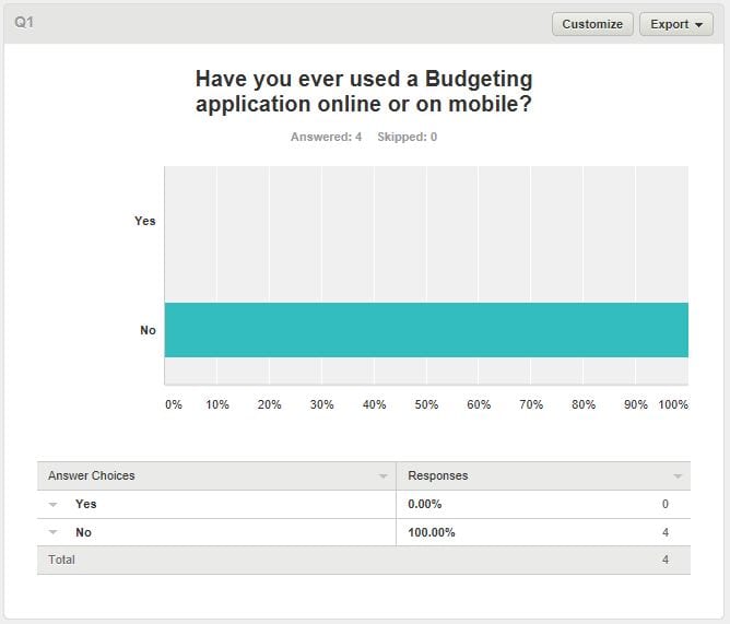
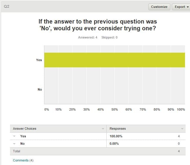
https://xd.adobe.com/view/0f015f41-0172-4006-8a37-938817e10133

Here is the link to the Semi-functioning Adobe XD file. I imported the finished graphics from Adobe illustrator into Adobe XD and used the utilities from the IOS utilities kit. I did this to add the Wi-Fi, time and charge percentage to all of the screens to replicate the professional qualities of an IPhone application.

As I had imported the exported graphics straight from Adobe illustrator, I could not use the buttons as I would have liked as they were not individual objects. The way I got around this problem was I created transparent objects that sit over where the interactable buttons should be on the IPhone. I then linked the transparent buttons to the right page and even made the symbol the back button to take the user back to the previous page.

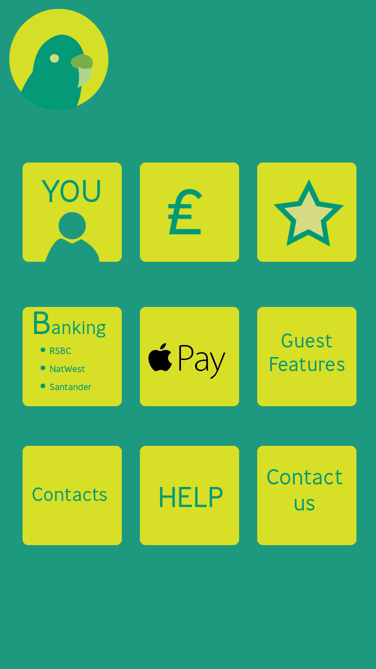
Here is a print screen to show the links from all of the individual buttons to their separate pages.

screens XD print screen

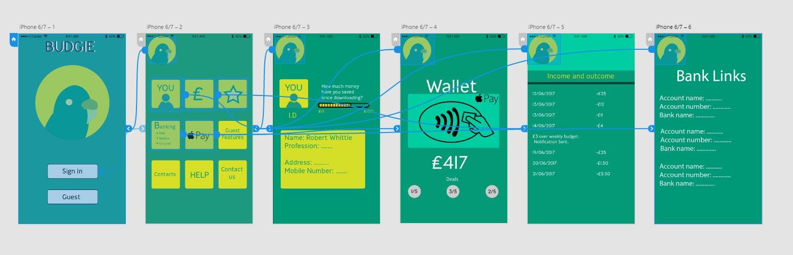
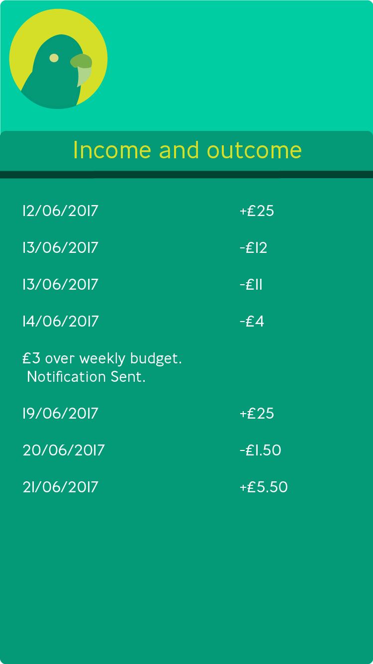
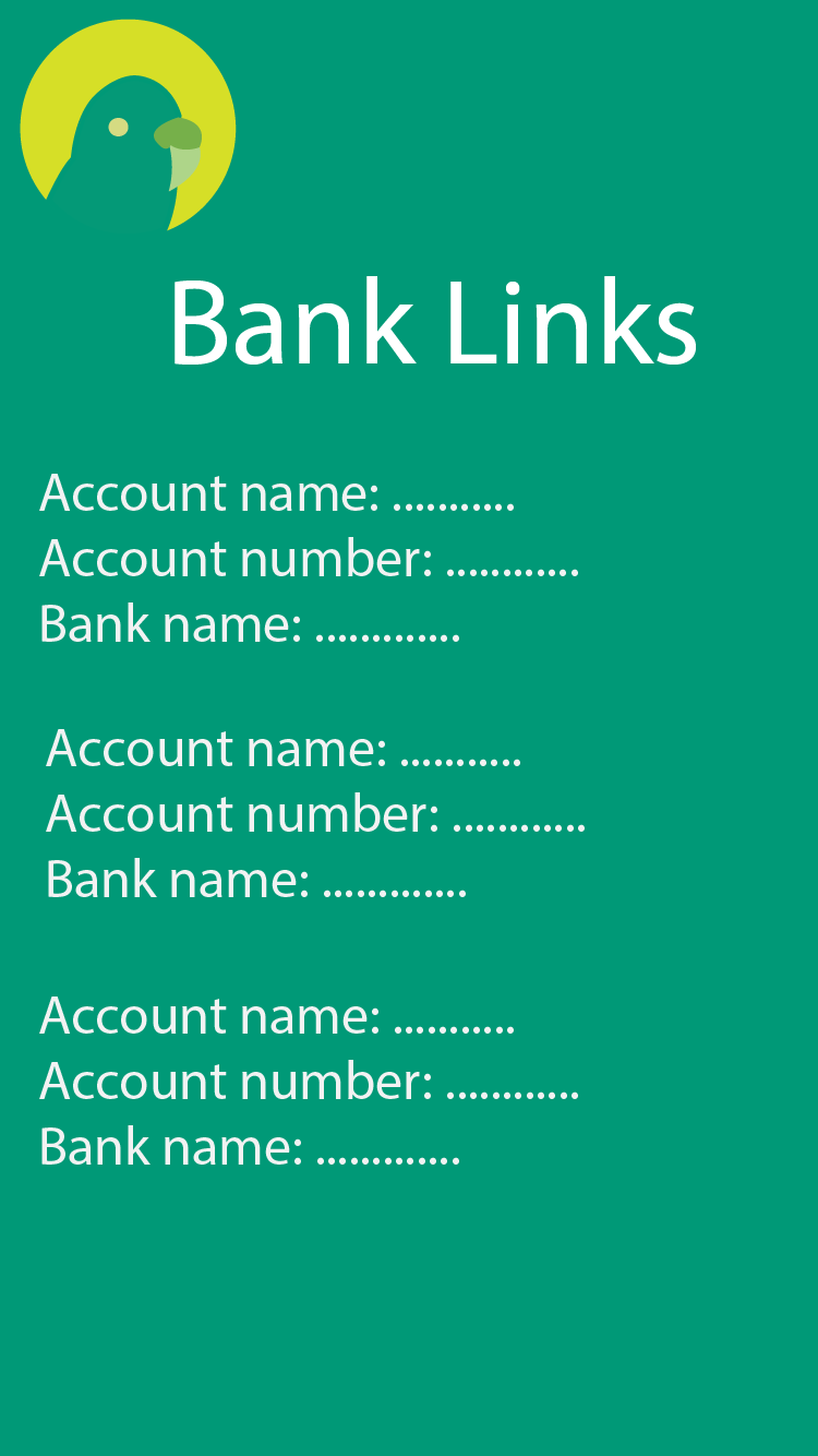
As you can see, the initial sign in screen takes the user to the menu page where they are given a selection of buttons. The first button is the account button that will take the user to their own personal I.D page and how much they have personally saved over the month, or year. The £ button will take the user to their income page, mimicking any bank page, showing the user how much they have coming in and how much of the budget they have left. The next button would be taking the user to their bank account and bank account lists. The user can have more than one functioning at a time and can specifically switch between them.

Screens

For this part of the project, I took inspiration from YoYo Wallet and how they set up their screens and design throughout the whole of the application. I used the colour scheme I had originally chosen and the logo that I thought would represent the project most professionally and uniquely. I made 6 screens in total, I had originally wanted to create 7 screens but found that one of the screens was irrelevant and I could combine the two features of the two screens together. The other screen I cut out was the deals screen, that took heavy inspiration from YoYo wallet, as I thought that this would be a good idea, but I changed it and put it in with the apple pay and wallet screen.

Sign in screen

Menu screen

i.d screen

income screen

Bank account links screen

Wallet screen


Primary Research

To get the most out of my idea and to see what me target audience would want I thought it would be best if I was to carry out my Primary Research through the social media website Facebook. I firstly uploaded my logos and asked the public what colour scheme was best out of the three.

Logo Primary research

I had 5 Votes for the first green and yellow colour scheme.

14 votes for the second lighter, more washed out colour scheme.

And the remaining 30 votes for the purple variant.

I then uploaded a second status with the link of the survey I had created on SurveyMonkey.com.

https://www.surveymonkey.co.uk/r/HC5XKH3

Survey facebook post

I included 7 questions that I thought were important to my research.

Here were the responses I got.

Q1


Q2

Q1 responses

Q3

Q4

Q5

Q6

Q7

Q7 responses

Logo creation and fitting the colour scheme

Logos

I created these logos following the colour scheme that I wanted for my application in Adobe Illustrator. With a copious amount of help from my peers, I decided to go for this logo instead of the first logo created in my drawings on paper. I created this one digitally, instead of the other initial idea, because I felt that this idea was simple enough to not confuse the audience but creative enough to project the idea of ease of use and a fun interactive element over to the audience.

Although a Budgie does not correlate with budgeting and handling money, it is a popular mainstream marketing technique to use small worded slogans and fun and creative logos. An example of this would be the buying and selling app ‘Shpock’. Shpock is a made up word but somehow they have marketed it into a fully functioning application where hundreds and thousands are using it daily to buy new items or sell unwanted gifts.

I used Adobe Capture mobile app to take a picture of my initial drawing on paper and then scan it in to Adobe Bridge in which I could place it straight into an illustrator file and trace around on a new layer using the pen tool. I chose the flat colours because I wanted to keep the logo creative without making it seem boring but wanted to keep it to a professional standard. The first colour scheme was the more favoured one as it used the widest range of colour that mostly symbolised the Budgie animal, whereas on the other side of the spectrum the purples and more violet colours were a variant just to test out what worked and what did not. The middle colour scheme seemed like the stroke of the lines seem to wash away into the background of the circular logo and this may be harder to see when on a smaller mobile interface.