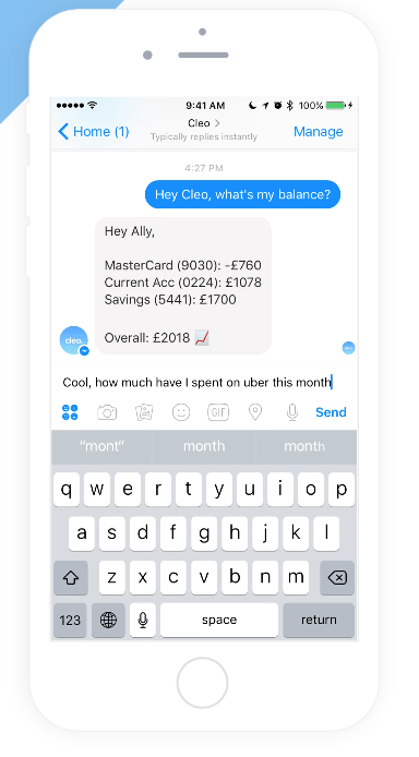
This is Cleo, Cleo is another rivalling budgeting app that allows its users to text in and get an update on how much they are spending. It shows specific amounts of money from more than one bank account, this is a feature that I would like to imply to my application. Cleo is shown to be an A.I in the adverts and is also made out to be able to hold a conversation with the user. This is a good idea because it allows you to get information about your spendings and bank account with a sentence. The only problem is that it is all manual and you have to remember to check up on your budget, where as budgie will send you the push notifications weekly without having to manually check, therefore decreasing the risk of forgetting. I personally do not like the idea of an A.I figure as it makes the app very informal and reliant on another person that is not actually real. However this allows the user to connect to this program, almost as gif they are talking to a friend or colleague about their financial problems. On the MeetCleo website it shows a promotional video of various users around the world that share their experience with the app and how they have spread the idea through word of mouth to all of the people they know. Cleo uses the stock messenger design used on apple iPhones so it would be quite difficult to use on android phones as the setting would not fit the phone, if I was going to create the text idea it would have to be universal through both android and iPhone. The app Cleo has a distinct target audience of people who use smart phones and specifically apple I phones daily, this is mimicked through the use of the interface as it relies upon the resemblance of the text screen, this shows that the target audience is younger and assumes that younger people are in need of financial aid. You would not see an older person (in their late 50’s) accessing the informal Cleo app and texting into the fake Ai software, attempting to get a reading of their many bank accounts. As this application is so informal it allows the younger generation to enjoy using it whilst the older generation are left feeling that the app is impractical as they may not want to have to text to get results.

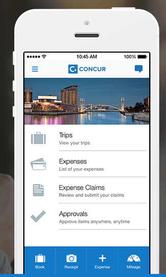
This is concur, allowing users to control their money and money and specifically for the traveling business person. It allows the user to take a picture of a receipt and it will be automatically be uploaded into an expenses claim, this works with hotel transactions and credit card transactions as well. Concur seems to be focused on business and the traveling man, this is very specific and would not really help out with a different target audience. The design is very factual and not easily read but fitting due to their target audience, this is backed up with a picture. As this application is shown to be a lot more complicated than Cleo, it will not be popular with the younger generation as they may not be able to understand what is being said, especially the uses of technical terms such as approvals, expenses and expense claims. However, the older generation and the if used by the traveling business man or woman, the application may allow them to control complicated purchases and records with the use of their smartphones. I like the idea of the design of the image in the background to make the application interface screen seem more lively but unfortunately I do not know whether it links up to the location in which the person who inputted the information was actually staying in that location.
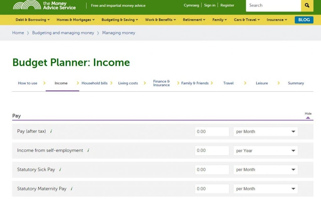
MASS money advice service
The money advice service is a government run website that allows it’s users to generate a theoretical budget therefore allowing it’s users to think of how much money they will have in the next couple of years on the wages they already earn. This is a brilliant website to help its users, specifically for saving up for bigger items, like houses or new cars. It also gives out budgets regarding how much you spend and how much you earn weekly. This is a good Idea but requires the use of a computer. When I create budgie I want to develop this sort of system in which the person can input their wages and income into the app and it would automatically generate the weekly budget. The ease of the website is good as it is interactive and simple, and the screen isn’t overloaded with numbers and statistics. The target audience for this would be 20-30 as it is factual, yet simplistic.
Yoyo Wallet – (http://yoyowallet.com/)
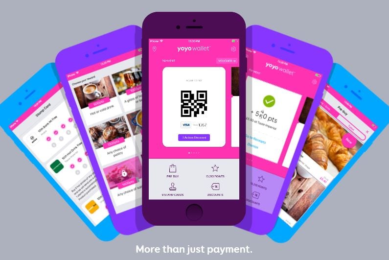
Yoyo wallet is an application that is not entirely linked to budgeting and saving money but what it does allow you to do is pay at your local supermarket, or anywhere for that matter, using the details on your phone. This will use your Debit or Credit card and will allow you to leave them at home, when previously scanned on to your phone, and then you can use your phone to pay contactless in store. This is a good idea because it reduces the risk of your actual card being stolen and the use of your mobile phone makes it easier to keep your possessions organised. Yoyo has a very good feature where it will automatically detect any offers or any deals that entitle you to free items in store. For example, if you went to McDonalds for a coffee and paid with yoyo wallet it would automatically show you how far you have got to go to get a free coffee e.g. 1/6. This aids a sense of achievement to the application and also transforms it into a sort of game for the user.
This application changed the way I thought my application was going to run. originally I wanted a simle budgeting app that would allow the user to control his spendings through notifications, but there would still be a way of overspending but with the research into yoyo wallet and how it allows you to pay with your mobile phone, it made me think about how my application could have this feature and if the user had made a weekly budget it would restrict the amount you could spend on your phone. For example, if the user only had £4.90 left for his weekly budget but wanted to buy an item of clothing costing him/her £5, it would not let him pay for it but it would log down what he was trying to pay for and then when his weekly notification reminding of his budget renewal comes in it will also show what items he missed out on buying and it reminds him if it is worth purchasing.
The aesthetics for the yoyo application is a very vibrant pink, but this does not mean that the application is to be used by women, it means that the pink is genderless and everyone can use it. It also uses a interactive screen so that is seems fun and simplistic for it’s technophobe users. Overall I think that this application is very useful and has inspired me to develop my idea to a more complex but fun to use idea.