For the week 10 weekly workshop we had individual time with our tutor that allowed us to ask questions and solve problems that I could not solve with just peer feedback. I asked my tutor about the problem I was facing with my Logo colour scheme and how I could solve it. The problem I was facing was that the logos I had created were all very simplistic but the first two fit the flat green colour scheme that related to the topic of budgies and money, the third colour scheme on the other hand was a complete variable and was purple and white. Although this was totally unrelated to the topic of money, my primary research found that the target audience preferred it over the other two.
After talking to my tutor he said why not try getting rid of the outlines of the budgie in the middle of the logo and simplifying it further. He also mentioned flipping the clashing yellow outline of the budgie with the background, so that the bird stands out a lot more. Here are the logos without the outlines. I personally think the first logo is now much more preferable than the other two colour schemes. The only problem with this first image would be attempting to fit the screens of the application around the yellow background.
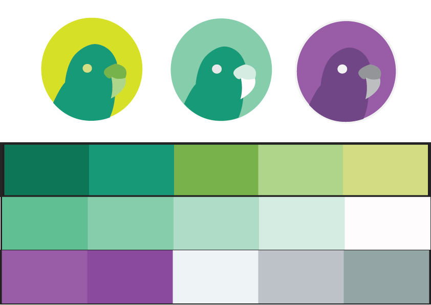
I think this idea of the logo is smoother and makes the colours clash a lot less. They also look more professional than the other ones, the only problem with the yellow background is that it is quite vibrant.