Primary Research

To get the most out of my idea and to see what me target audience would want I thought it would be best if I was to carry out my Primary Research through the social media website Facebook. I firstly uploaded my logos and asked the public what colour scheme was best out of the three.

Logo Primary research

I had 5 Votes for the first green and yellow colour scheme.

14 votes for the second lighter, more washed out colour scheme.

And the remaining 30 votes for the purple variant.

I then uploaded a second status with the link of the survey I had created on SurveyMonkey.com.

https://www.surveymonkey.co.uk/r/HC5XKH3

Survey facebook post

I included 7 questions that I thought were important to my research.

Here were the responses I got.

Q1


Q2

Q1 responses

Q3

Q4

Q5

Q6

Q7

Q7 responses

Logo creation and fitting the colour scheme

Logos

I created these logos following the colour scheme that I wanted for my application in Adobe Illustrator. With a copious amount of help from my peers, I decided to go for this logo instead of the first logo created in my drawings on paper. I created this one digitally, instead of the other initial idea, because I felt that this idea was simple enough to not confuse the audience but creative enough to project the idea of ease of use and a fun interactive element over to the audience.

Although a Budgie does not correlate with budgeting and handling money, it is a popular mainstream marketing technique to use small worded slogans and fun and creative logos. An example of this would be the buying and selling app ‘Shpock’. Shpock is a made up word but somehow they have marketed it into a fully functioning application where hundreds and thousands are using it daily to buy new items or sell unwanted gifts.

I used Adobe Capture mobile app to take a picture of my initial drawing on paper and then scan it in to Adobe Bridge in which I could place it straight into an illustrator file and trace around on a new layer using the pen tool. I chose the flat colours because I wanted to keep the logo creative without making it seem boring but wanted to keep it to a professional standard. The first colour scheme was the more favoured one as it used the widest range of colour that mostly symbolised the Budgie animal, whereas on the other side of the spectrum the purples and more violet colours were a variant just to test out what worked and what did not. The middle colour scheme seemed like the stroke of the lines seem to wash away into the background of the circular logo and this may be harder to see when on a smaller mobile interface.

Colour Scheme Ideas

https://color.adobe.com/Emerald-color-theme-2268799/?showPublished=trueScreen Shot 2017-03-02 at 11.31.00

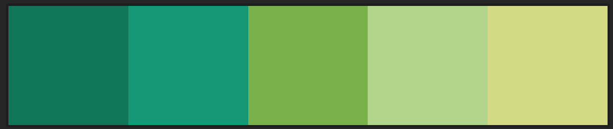
Whilst searching through Adobe Color and Google images, I was looking specifically for greens and flat greens. I used Adobe Color to help me find other groups of colours that worked well professionally with the flat colour green.

This is a colour scheme that I liked and it uses colours that complement each other around ‘Emerald’. Through some thorough research, I found that I would want two shades of the colour green that complement each other, whereas my peers though that I should implement a more yellowish kind of green, to mimic the colour of a budgie. I found that this colour spectrum has a wide range of greens, from turquoise to a more yellowy green. If I was to use this for my application logo I would use the darker colours at the back but leave the lighter colours at the front.

https://color.adobe.com/Flat—Green-v01-color-theme-7025902/?showPublished=true

Screen Shot 2017-03-16 at 10.32.34

I like the looks of these colours as it replicates the colours of the exercise chain PureGym. The flat green colour, almost turquoise, complements the white colours and as the green gets lighter it would allow the page to have different shades of colour making the background and the individual items/buttons not seem plain and boring. The white would be a good colour for the text or stroke lines for the logo, but I am not sure if it would show up entirely and this would be a problem as this would be scaled down to either an iPad or most likely a iPhone. I asked my peers and they said that this colour scheme does not represent budgies enough and the first colour scheme is better.

https://color.adobe.com/Flat-Violet-color-theme-2753689/?showPublished=true

Screen Shot 2017-03-16 at 10.52.55

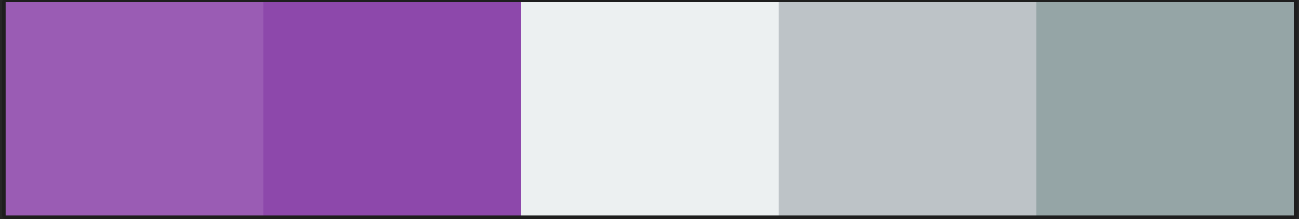
This is a different colour scheme altogether just to vary and see if this is acceptable. I will create the logo in all of these different colours and I will put them up on Facebook for my friends to vote which ever one they find the most aesthetically pleasing.  These colours are just alternates to the green colour scheme as a variant and I was fixated on the white writing on the violet background but I don’t want the application to seem too childish as it needs to fit to my intended target audience.

YOYO


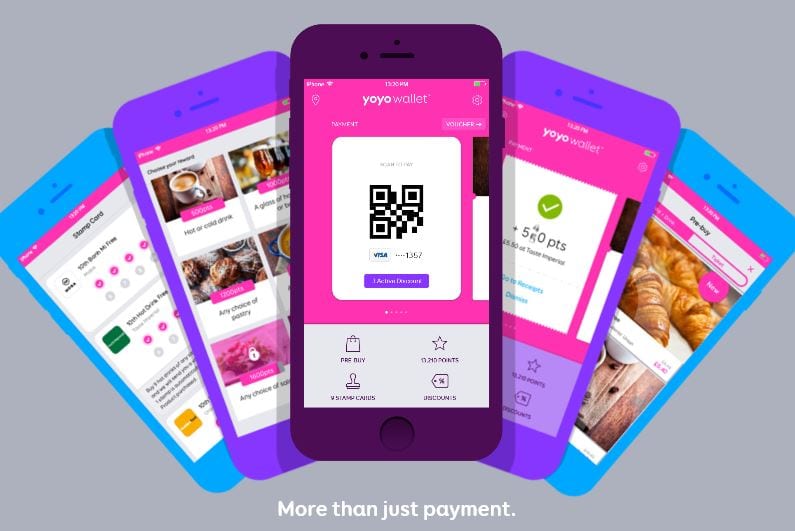
Yoyo wallet uses Pinks and white for it’s colour scheme. This is simple and effective, there is always the discussion that pink is more of a feminine colour but it seems to work brilliantly for it’s users. The white stands out from the pink and they complement each other, although the Pink is very vibrant.

Week 8

The week 9 workshop focused entirely on InDesign and working through different text styles and this was eye opening for me as I have never really used the software. Although I found it challenging in the beginning of the workshop, I managed to sort it out by the end of the workshop. We had a look at an online journal/gaming magazine and how the design could  be improved and then we had to remake it by importing the pieces of text and graphics into InDesign. We were allowed free range to create whatever we wanted, wether it would be changing the colour scheme so it was not too distracting for the viewer’s eyes. I had a look at the logo and how it was too big for the page, I also looked at how it was a black graphic on a white background and how by changing the background colour to white, we could make the background fill of the logo look like a transparent png. I would probably use InDesign in the future if I was focusing on newspaper articles or magazine, but other things I would probably use illustrator or photoshop.

Week 7

Throughout the week 8 workshop we were independantly looking at what work we had to do on the gantt chart and when we had to complete it by. I focused on Logo ideas, whilst I was at home I redrew my logos into illustrator (originally on paper) and then I made sure to edit out the lines of the lined paper. The lines made it difficult to create a professional image, If I was to redraw them I would trace them on a blank piece of paper instead of lined paper. I looked at the different colour schemes and I tried different greens and yellows that fit with the theme of my screens. I chose a specific colour scheme off Adobe Color, this showed that colours like emerald and flat yellows complemented each other quite well. I need to set up a style sheet/ ideas sheet of all of my different logo designs.